World Function Collapse
World Function Collapse
About
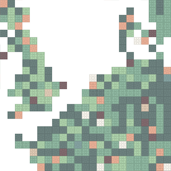
World Function Collapse began with a dataset from the European Space Agency: land coverage data drawn from satellite imagery, tracked per country, per year, broken down into distinct categories of terrain. The aim was to see how the surface of every country on Earth had actually changed over time, not as an abstract statistic, but as something you could look at, land by land, and read like a landscape.
The result was a single, enormous print at A0 scale, generated using wave function collapse (an algorithm best known from procedural generation in video games). At its core, the technique is a set of adjacency rules: water can only sit next to sand, sand only next to grass, grass only next to trees, and so on. Applied recursively across a grid, these constraints produce shapes that read as natural, organic terrain rather than random noise. For every country, the algorithm generated a field of tiles sized and weighted according to that country's actual statistical land coverage (how much water, how much grass, how much forest) while the same adjacency logic clustered matching terrain types together, the way coastlines and forests actually cluster in the real world.
The map works in layers. From a distance, each country reads as its own miniature terrain, built from its real land coverage data. Zoom into the small tiles within a country and a second layer appears: each tile shows whether that particular category of land had increased or decreased in share since the start of the measurements. Two dimensions of information were already legible this way; what the land was made of, and which way it was moving.
A third dimension lived beneath the surface, literally. Exact figures for each tile were printed in UV-reactive neon ink, invisible under normal light. A small handheld loupe fitted with a UV LED and a battery let a viewer bring that ink to life, tile by tile, country by country — reading precise numbers without ever needing to overlay the print with labels, legends, or annotation. The piece was built to be approached at close range, face near the paper, working through it country by country, rather than absorbed in a single glance from across the room. Density of data, without visual noise.
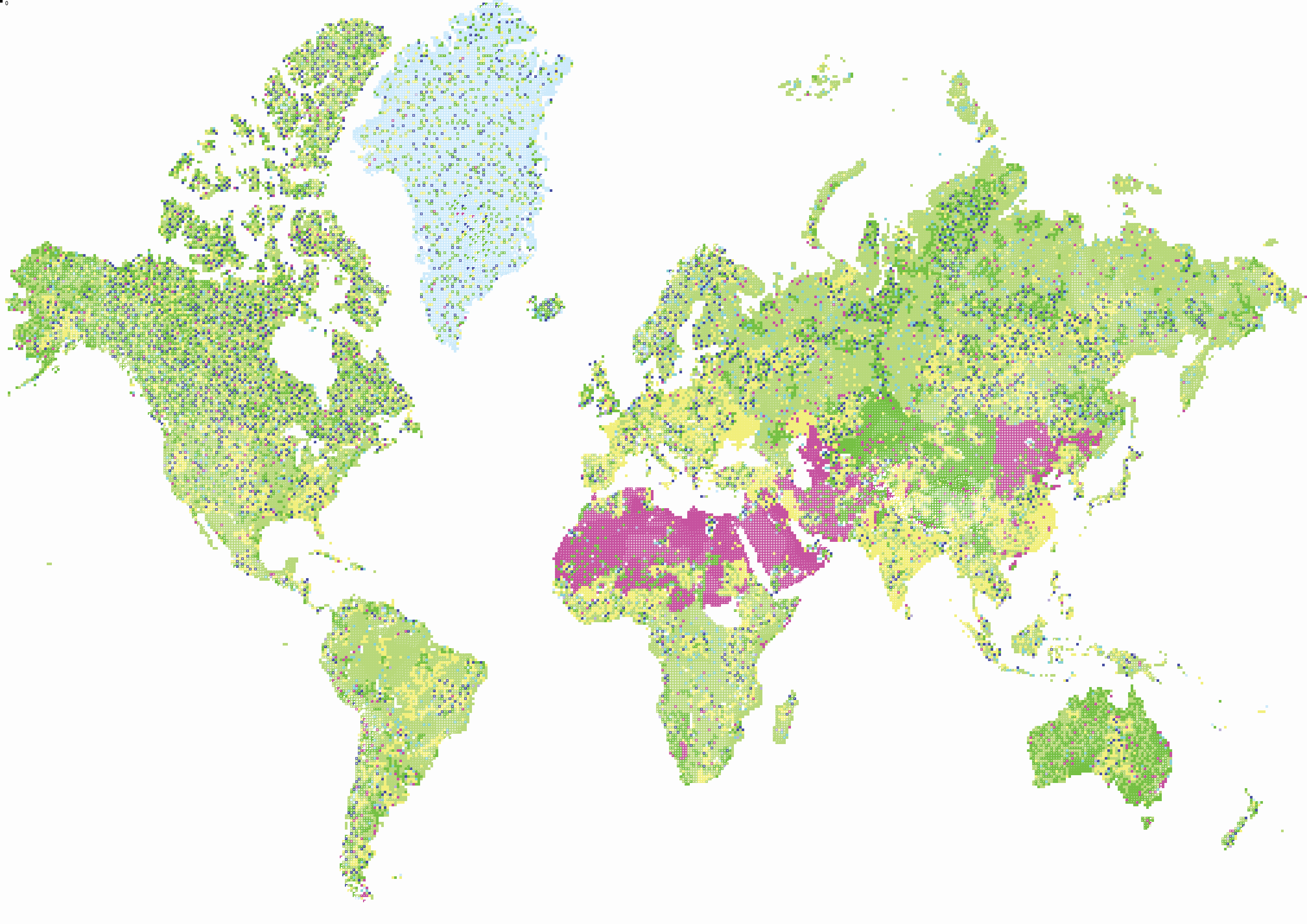
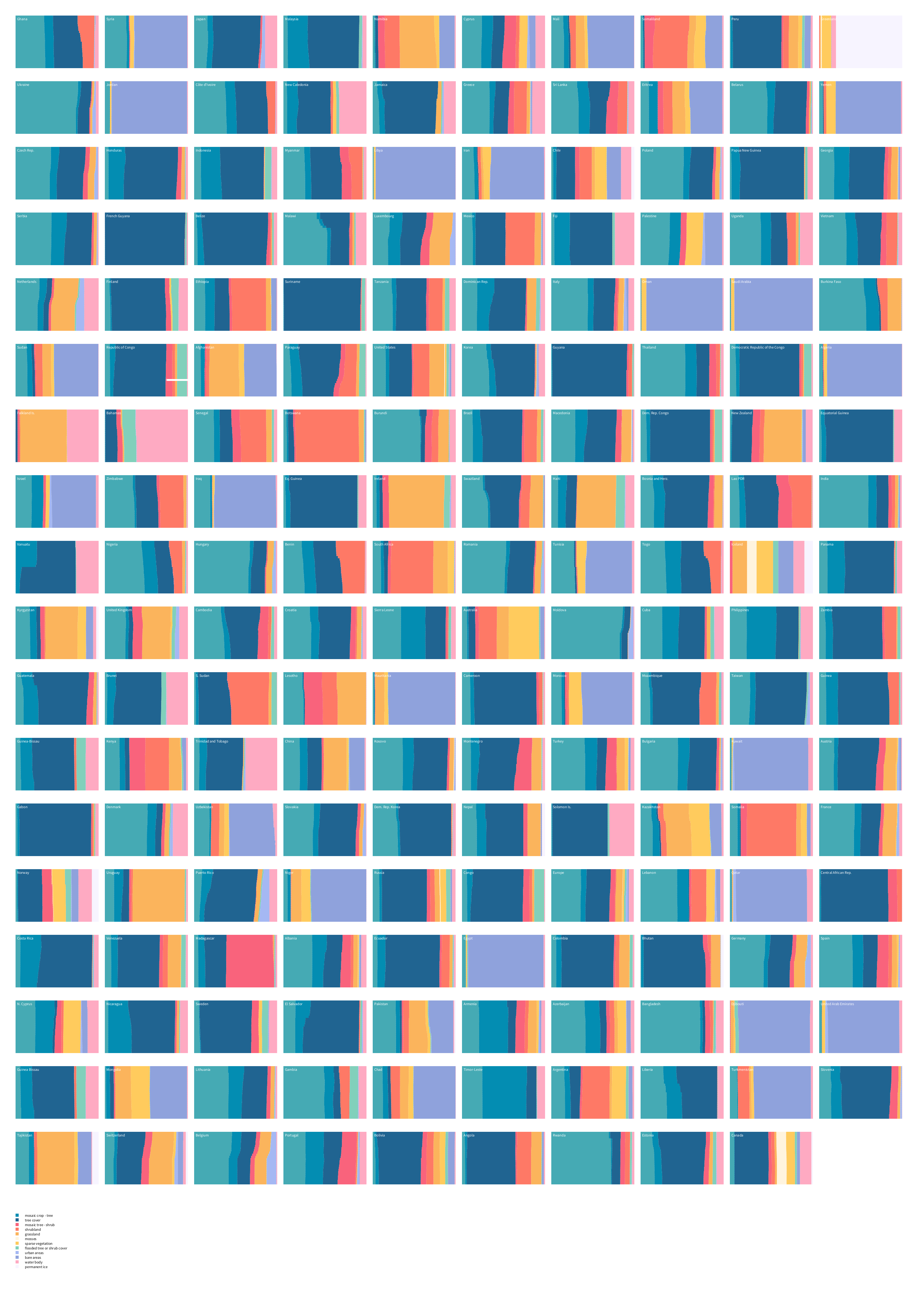
The project produced a full A0 poster series covering the complete dataset, a poster depicting the stacked charts per country, and a separate poster made for the ESA competition itself: the entire world rendered as a single, unified island, generated with the same wave function collapse process used for the individual countries. That poster went on to win the competition.

Details
Year — 2024
Client — ESA
Tags — Data visualisation, Interactive, Print, UV
Tools — Web, processing, print